Dhtmlx Charts
You now have the ability to view charts in FYI and NL using Dhtmlx Charts. This offers an advantage over using Google Charts as it does not have to send data to Google to create the chart, which means you no longer have to be connected to the internet to view charts.
Using Dhtmlx Charts in FYI
In FYI, when you run a report and go to the Chart tab, there is now an option to view the chart using Dhtmlx.
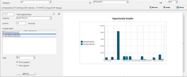
You can create Bar, Pie, and Line Charts. When using Dhtmlx charts, if you hover the mouse over one of the segments of the graph (specific bar or section of a pie chart), it will display the value of that segment.
When using a Bar Chart, if there are multiple series as above, you can click on a series in the Legend and it will hide that series in the graph. Click on the Legend again, and it will show the series. If you select Show Values in the options, it will display the value above each bar.
When using a Pie Chart, if you click on the Options setting, you can select to use a 3-D Pie chart. If Show Values is selected, the graph will show the value of each segment of the Pie, if Show Values is not selected, the graph will show you the percentage of the Pie each segment makes up.
Using Dhtmlx Charts in NL from a RM Report
Setting up charts to be displayed in NL from a RM Report is done the same way for Dhtmlx Charts as it was done for Google Charts. In the NL Report Params record (NL0104), there is a new option in field 6 Format Include Data, you can now choose option “H – Chart (Dhtmlx)” to specify to use Dhtmlx Charts.
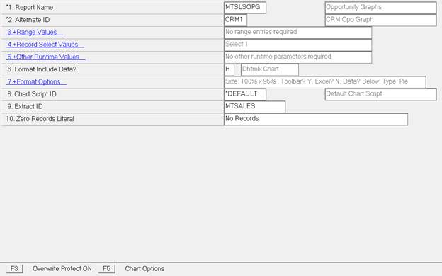
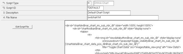
Field 8, Chart Script ID, will use a new default script type of “H – Dhtmlx Chart” which uses the new chart script template swdchart.txt:
Once the record is set to use Dhtmlx Charts, use the F5 Chart Options to set up how you want the chart to be displayed in NL.
To see an example of how this is set up, in the new Remote Sales Portal, you can go to the Analysis/Pipeline page:
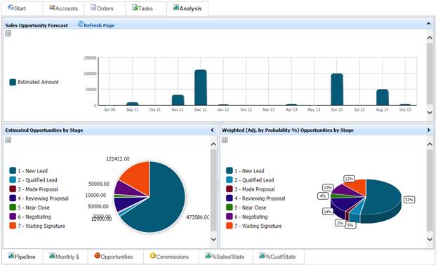
This is running the NL Request MTSLSPIPELINE and all three graphs are coming from the RM Report MTSLSOPG with alternate ID’s CRM1, CRM2, and CRM3.
Using Dhtmlx Charts in NL for an XM Graph
You could set up a Google Chart for an XM graph by specifying in the html template all of the values that were needed to set up the graph, such as the title, x-axis values, y-axis values, the type of graph to create, etc. An example of this would be in the CRM Portal on the Reports tab, the Month Trend graph:
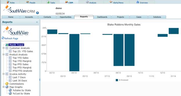
This is set up in the html template
wicrmsalesmonth.htm: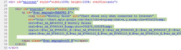
This can also be done now with a Dhtmlx Chart and an example of this using the same XM Graph can be seen in the new Remote Sales Portal in the Analysis/Monthly $ tab:
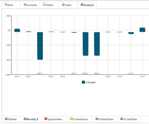
This is set up in the html template mtslssalesmonth.htm. The details below go over how this is set up. It would probably be best to look at the mtslssalesmonth.htm page while going over this to follow along to help see what each part of the chart is doing.
In order to use Dhtmlx Charts for this, you would need to specify the following include files in the page header:
<script type="text/javascript" src="codebase.3/dhtmlxcommon.js"></script>
<script type="text/javascript" src="codebase.3/dhtmlxchart.js"></script>
<script type="text/javascript" src="swwifuncs.js"></script>
<link rel="stylesheet" type="text/css" href="codebase.3/dhtmlxchart.css">
<link rel="stylesheet" type="text/css" href="widefault.css">
NOTE: The dhtmlxcommon.js file must come before the dhtmlxchart.js file and cannot be included again after the dhtmlxchart.js file.
In the page header scripts, you must also set up a function to create the chart when the page is loaded, using mtslssalesmonth.htm as an example:
Add_OnLoad_Function(function() {
doPrdChart();
})
This will call the function doPrdChart() when the page is loaded which is used to set up the chart.
The following highlighted section of the mtslssalesmonth.htm page is what is then used to create/display the XM Graph on the page. This basically replaces what was used for the Google Chart from the highlighted section of the wicrmsalesmonth.htm page above:
Here is what each part of this is doing:
<div id=”prdchart” ….
Set up a div on the page where you want to display the chart.
<span id="@var_xmgraph=SMANPRD_@"></span>
This tells the page which XM Graph is going to be used (SMANPRD in this case) so that the XV99 data dictionary fields are populated with the data for this graph.
<script type="text/javascript">
function doPrdChart() {
Create a script that will contain the function used to create/format the graph.
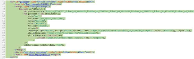
var prdcartdata = “data0,data1,…,data#\ndata0,data1,...,data#\n….”;
First define a variable that is going to contain a string of all of the data for the graph. Each step along the x-axis for a bar or line chart or each segment of a pie chart is separated with \n. With a bar or line chart, you can have multiple series on the graph, so you could have multiple values for each x-axis step, these are separated by comma’s. In this particular example we are setting the chart data to, one value, one description for each step along the x-axis:
@var_dd_XV990101_@,@var_dd_XV990061_@\n@var_dd_XV990102_@,@var_dd_XV990062_@\n…
(data0) , (data1) \n (data0) , (data1) \n…
XV990101 = Graph Value Column 1
XV990061 = Graph Value Description 1
XV990102 = Graph Value Column 2
XV990062 = Graph Value Description 2….
That sets up the data to be used in the graph, everything else now is to set up how the graph should be formatted.
var prdchart = new dhtmlXChart({
This defines that we are setting up a new chart that is going to be called prdchart. Everything inside the new dhtmlXChart function tells it how to format the graph. Each attribute must be separated by a comma.
view:"bar",
View determines the type of graph to be used, current options are line, bar, pie, and pie3D.
This is required.
container:"prd_chart_container",
Container specifies the html element ID where the graph will be placed. This is required.
value:"#data0#",
Here you specify which segment of the data string set up above is to be used for the value for each step along the x-axis. So in our example the first step along the x-axis will have a value of what is in XV990101, the second step along the x-axis will have a value of what is in XV990102, etc. This is required.
color:"#055A78",
Specify the color for the lines, bars, or segments of pie for the graph. This is optional.
tooltip:"#data0#",
The tooltip attribute will show the value of a bar, line, or pie segment if you hover the mouse over it in a graph. Or if you are on a touch screen, you can tap a particular bar or pie segment and it will display the value of that bar/segment. This is optional.
origin:0,
Origin can be used on bar charts to set the value for where the bars start along the y-axis. This is optional.
legend:{align:"center", valign:"bottom",values:[{text: "<span style='font-size:8pt'>@var_dd_XV990049_@</span>", color: "#055A78"}], layout:"x"},
The legend attribute is used to tell the chart where to place the legend and how it should be formatted. Align is used for the horizontal alignment and can be set to left, right, or center. Valign is used for the vertical alignment and can be set to top, bottom, or middle. Values is used to set the text for the legend (XV990049 Legend(1) in this case) and the color of the legend. Layout is used to define the text stretching in the horizontal or vertical direction (“x” or “y”). This is not required, but is recommended.
xAxis:{template: "<span style='font-size:7pt'>#data1#</span>"},
The xAxis attribute is used to specify what data is used for the x-axis values and how it is formatted. In this example we are setting the x-axis template to get its values from the data1 segment of the data string that we created. So the first step along the x-axis is going to be set to XV990061, the second step set to XV990062, etc. This is required for bar and line charts.
yAxis:{template: function(val)
{return "<span style='font-size: 7pt;'>" + val + "</span>"},
}
The yAxis attribute is used to specify the values and formatting of the y-axis. In this example, since we do not know what the max/min values might be, we are just letting the chart calculate the values for the y-axis. If you have a graph where you know what the max/min values are going to be, you could specify the start, end, and step values for the y-axis for example:
yAxis:{
start:-100,
end:500,
step:100,
template: function(val)
{return "<span style='font-size: 7pt;'>" + val + "</span>"},
}
If you specify the start, end, or step value, you must specify all three. The yAxis attribute is required for bar and line charts, but can be left empty if you want the chart to calculate the y-axis values and not do any formatting.
prdchart.parse(prdchartdata, "csv");
This tells the chart that we defined (prdchart) to parse the data from the data string that was defined (prdchartdata).
<div id="prd_chart_container" style="width:900px;height:400px;"></div>
<span class="@var_xmgraph=off_@"></span>
Create the div element where the chart will be placed, this is the element specified by the container attribute when setting up the chart. Finally set @var_xmgraph=off_@ to indicate you are done with that XM Graph.
There are a couple other options for the Dhtmlx charts that you may want to use that were not in this example.
If you want to show the value of a bar, or point on a line, or segment of a pie on the chart, you can use the label attribute and specify which segment of the data string should be used. For example:
label:"#data0#",
This is specified inside the new dhtmlXChart function along with the other attributes.
If you have multiple series that you want to display on the graph, for example, maybe you have two sets of data for each x-axis step that you want to display to compare the two. When you define the chart data, it would be set up like this:
var mychartdata = “data0,data1,data2\ndata0,data1,data2\ndata0,data1,data2\n…”;
Set up the chart as was done above. For the value attribute, set up which data segment applies to your first set of data, let’s say data0, and for the xAxis attribute, set up which data segment applies for the x-axis values, let’s say data2.
Then after you parse the chart data, you can add an additional series to the graph, which would come from data segment data1. You would add the series like this:
mychart.parse(mychartdata, "csv");
mychart.addSeries({value:”#data1#”,color:”#0887B5”,label:”#data1#”,tooltip:{template:”#data1#”}});
The only option that is required in the addSeries is the value, you would want to add the color, label, and tooltip, if they were also set up in defining the chart.